
Altered States - 2006
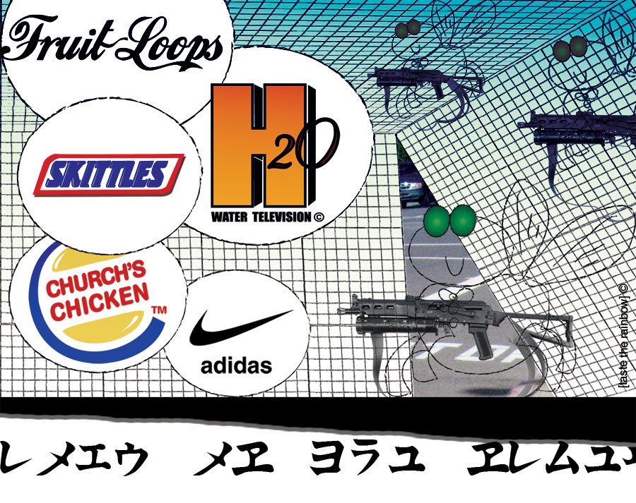
Nothing says “fun” like taking the name of a business and using it as part as another business’ logo. I’ve been meaning to do this for a long time. Something about noticing how children understand logos without knowing how to read. I’m sure many people will NOT notice I changed Burger King’s logo, because it depends so heavily on graphics and colors.
Anyway, I originally thought of this as an installation composed of different signs. People walking through an art space with different altered logos spread through the area. At first, people would not notice the changes, until they finally do and start looking out for them intentionally. I group all the logos in one file for the purpose of displaying them all together nicely.
Just Say No
This project is based completely on type. Impact is a great font for these sort of posters. It gives it power and thickness. I’m basically doing most of these in Illustrator. Before this summer, I barely used that software, but I realize it is important for me to feel comfortable brainstorming in the Illustrator canvas. This is my first time using masks here, and I like what they do, so we’ll be seeing more of that in the near future

Apple (Pie) - Tracing
Well, this is it. I’m continuing playing with the alteration of corporate identities. In this case, I gave full attention to Apple, better known as the Apple-Pie, quite a popular spin-off in this island of ours. The same way iPod breeds new life to the years-old rotoscoping technique, i’m hoping to add a scrappy quality to the very well-known white ads of apple computers.
The new technique appreciated here is the Illustrator auto-tracing. I tend to do it on Flash, not on Illustrator, so it was nice to try something new. A friend of mine described this as “electric,” and I guess that’s a good word to label it.
I’ll include two images… because I said so.

