
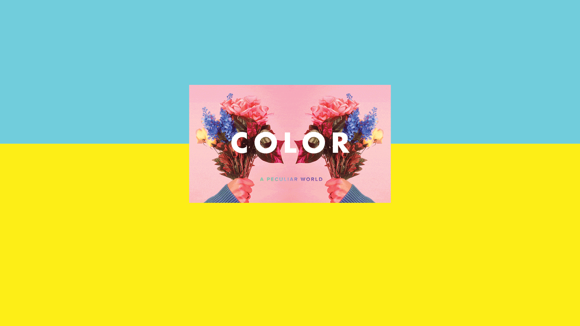
The Peculiar World of Color

When you think of color, you probably think of something like this: A digital-color picker, as obscene and overwhelming as an all-you-can-eat buffet.
As with all readily available commodities, nowadays colors are easy to take for granted. But this wasn’t always the case. Before the 20th Century, color was anything but accessible. To anyone.
Color accessibility (and even ocular perception) is directly related to a geographical region’s ability to replicate and distribute particular colors. And, to make things even more confusing, different civilizations arrange colors differently. So what’s blue to us could be purple to someone else, or quite simply invisible.

Discovering Blue
A good example of this “color relativity” can be seen in the color blue. This color, which in Western culture is associated with harmony, confidence, and imagination, is actually quite difficult to recreate artificially. Because of this, the very word “blue” did not exist in most regions until 4,500 years ago.
Thanks to studies conducted by William Gladstone and Lazarus Geiger, we now know blue is not even mentioned in The Odyssey, the Koran, the ancient version of the Hebrew Bible, nor in ancient Chinese stories, confirming blue’s late arrival to the hall of colors.
The only ancient civilization that had a word for “blue” was Egypt. And yes, you guessed it. They were the first to artificially create blue dye and to incorporate it into their lives. It seems that human perception is so biased by culture, that even colors, which might initially be considered an obvious part of our reality, are mostly visible through a cultural context.
Mauve
Another example is mauve, which came into existence purely by accident. William Perkin, a young chemist in 1856, was in search of a synthetic cure for malaria. He never managed to achieve that goal, but his dye ended up in the closet of Empress Eugénie (Louis-Napoléon Bonaparte’s wife) and Queen Victoria. This royal association catapulted mauve into global popularity. William Perkin dipped a piece of silk in the new-found wash-proof dye, and paved the way to the infant industry of chemically created colors.

Ultramarine
For hundreds of years, ultramarine could only be mined in Afghanistan’s Sar-e Sang mountains, and its availability in Europe was directly influenced by trade routes and politics. Venice was the first European country in ultramarine’s path, so it could be acquired there at a reasonable price. The further into Northern Europe an artist went, the more expensive and less available the color became. Supply of colors directly influenced regional artwork.

Green
Green is another color with a strange background. Even though it currently serves as the face of the environmental and organic movements, it was previously perceived as the exact opposite. Probably because the technology to artificially create green took a while to advance, and the fact that it was often quite toxic (a mix of copper with arsenic trioxide). Green remained a poisonous color all the way into the Victorian era. In the 1800s, Dr. A. W. Scheurer, commissioned by the Ladies’ Sanitary Association, ran a number of tests in adornments workshops. He found that the average leafy headdress contained enough arsenic to poison 20 people.

The War for Color
These color controversies are certainly not a thing of the past. Even today, as new technologies push paint and ocular perception into new dimensions, we find that as much as it might feel like the battle for color accessibility has been “won”, we are far from reaching that point. Recently, a dispute between artists Anish Kapoor and Stuart Semple over black, shook the art world. Vantablack (an ultra-black color) was developed by Surrey NanoSystems a few years ago. Kapoor ended up attaining exclusive usage rights to the shade, meaning other artists were unable to access it. This inspired Stuart Semple to launch an anti-Kapoor campaign. He developed his own unique colors and explicitly banned Kapoor from using them. In fact, things are so heated between them, that they have taken their conflict to the ultimate battleground, Twitter.
Final Thoughts
Our relationship to color is far more complex than what we might have initially thought. Is it a black & blue dress or a white & gold dress? Is it Yanny or Laurel? We may never know how or why our brains process everything so differently. But when you’re making your next book, pause for a second and consider the journey that hundreds of artists, scientists, miners, politicians, business people, and innocent bystanders went on to land us where we are today. With a vast land of colors, right at our fingertips.
References:
http://www.iflscience.com/brain/when-did-humans-start-see-color-blue/
https://en.wikipedia.org/wiki/Egyptian_blue
http://www.dailymail.co.uk/sciencetech/article-2976405/Could-ancestors-blue-Ancient-civilisations-didn-t-perceive-colour-didn-t-word-say-scientists.html
https://en.wikipedia.org/wiki/Blue
http://www.radiolab.org/story/211119-colors/
https://www.chemistryworld.com/feature/egyptian-blue-more-than-just-a-colour/9001.article
https://pictorial.jezebel.com/the-arsenic-dress-how-poisonous-green-pigments-terrori-1738374597
https://www.wired.com/story/vantablack-anish-kapoor-stuart-semple/