Cute stye - 2006
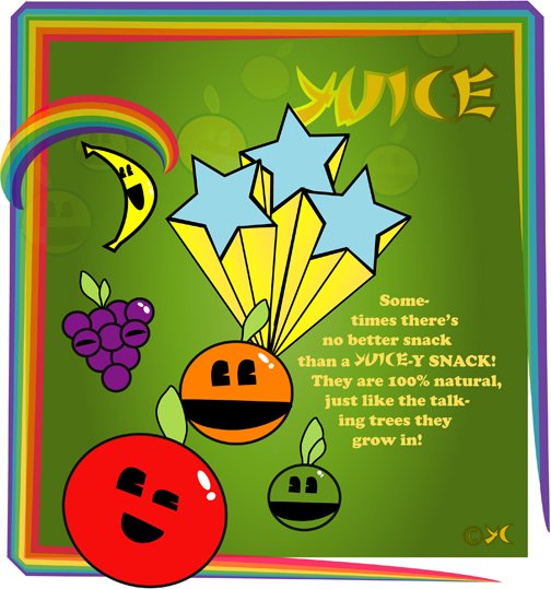
Well, after failing today’s attempt of creating a “page turning” effect in FLASH, I decided that I needed to meet my daily quota of design, and fast. So, I started to flip through one of my design books to get inspired. What could my subject be? I saw a “cute” ad that made me want to create a poster advertising candy, merging the 1950′s dancing food commercial with Japanese “cuteness.” Of course, after you read the copy, you understand it is a parody.
At first I had no idea of how to achieve that look, and I realize it was important to have thick borders in everything. After that, everything came together better. Before “arranging” things, I found myself with tons of colorful fruits. Knew the only way to make it work was to give the fruits a “cascading fade-in” effect.


